
Well, hello there!
Since I first published this site, in October 2022—yes its that long ago there have been some updates.
I publish 2 articles, the first one about ensuring the focus appearance of focusable elements is accessible and the other about leveraging React Testing Library for accessibility testing.
Not much has happened on the blogging front—just a few small updates here and there, like improving the build process and bumping dependency versions. But I ended up doing exactly what I didn’t want to do: neglect the site and barely use it.
Recently, though, I got deep into optimising things. I’m not sure what kicked it off—maybe it’s because I revisited an old idea: adding a résumé section to my personal site. The goal? A clean, print-friendly version that recruiters could visit and print, using some clever CSS instead of a clunky Word doc. Buuuut… that’s still a work in progress.
In the process, I went down a bit of a rabbit hole and made some big changes over the past few weeks. Here’s a quick summary:
- Updated all dependencies to the latest versions—Eleventy is now at v3, which required some adjustments.
- Dropped Sass in favor of vanilla CSS, with a bit of PostCSS.
- Switched to Yarn—turns out I thought I was using it before, but based on my commits, that wasn’t the case.
- Updated CSS to use logical properties—replaced margin-left, margin-right, etc., with margin-inline-start and margin-inline-end to make future LTR/RTL support easier.
Then I just decided to look at how heavy my site is. Stupidly I thought "hey your a super awesome frontend dev, you made a static site. Its much better then any framework driven site, prepared to be amazed at thy self".
Shamefully, that wasn't the case, I was not amazed at thyself... far from it. When I checked with Cloudflare radar url scanner, the results were bad.
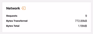
I was shocked at the results of the scan, ~1.20MB just to view my homepage. I dove into the networks list and found a few culprits:
- 9kb of Google fonts
- 111.1kB of Google analytics scripts
- 589kB for a single images
- 54kB of Netlify login script
I then went about improving this experience by attacking simple things:
- minifying the CSS—should of been done at the start but I think I lost that when I left SASS.
- moved the Netlify login script so its not on all pages, just the one pages its need on.
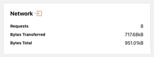
As you can see these simple changes got me under 1MB, but I didn't stop there.
Next, I had an existential crisis. Would my website survive without Google Analytics (GA)? What about other analytics options? Should I write my own?
To be honest, I’ve never actually looked at GA since installing it, so all I was really doing was pandering to the unwritten rule: “You must use GA on your website or be smote.”
Plus, I doubt I’d ever use GA to its fullest. And I definitely didn’t want to write my own analytics script. So I needed a replacement—enter GoatCounter.
Now, instead of loading 111kB of GA script to collect data I’ll never look at, I have ~3.5kB of GoatCounter script collecting just as much useful data (which, let’s be real, I still won’t look at).
Another quick win was self hosting the Google fonts instead of relying on Googles methods, plus making some font adjustments to reduce things like First Contentful Paint (FCP)and Largest Contentful Paint (LCP). I leveraged a few tools for this:
- google-webfonts-helper to download the files locally which have the charsets and styles I need and nothing else.
- Fallback Font Generator to tweak the fallback font so its not as jarring when the Google font kicks in.
I may have shaved off only 1kb with a result of 7.99kB by self hosting, but there are less requests now and the performance is better in relation to FCP and LCP. I think there is still more I can do here.
The most impactful update was dealing with images. I’ll be honest—I dropped that image on the homepage quickly, just because the design needed something other than text. Looking back, I could have optimised it ages ago instead of leaving a 675 × 675px image sitting at almost 600kB.
Over thinking responsive images original ramblings
Originally I wrote a completely custom function to handle images leveraging eleventy-img. I had been looking at two plugins and liked the idea using presets based off of a class, well that was painful and even when I published article images weren't working. I ended up scrapping all that custom work and just using eleventy-img the ways its intended which is sooooooo good! This is original text is still here as a reminder and allow others to learn from me, see the image.js function here and how I was using it in my config.
Implementing responsive images took some time. I leveraged an 11ty plugin called eleventy-img and even modified how I used it to cover images in markdown—mainly those inserted when writing articles with Decap CMS.
I identified a few presets for different images use cases, for instance my blog articles can have a hero image, which are a consistent size width wise so I wanted specific sized images for that.
My first attempt was good, but I needed to do more as I wasn't using the sizes attribute correctly, thats where this handy bookmarklet called RespImageLint - Linter for Responsive Images helped out. It evaluated where I was going wrong and suggest changes. Responsive images on my site is still not 100% perfect but its far better.
Well I firmly believe eleventy-img is the most amazing plugin ever—after learning the hard way obviously.
The way I'm using the plugin is by having a "default" configuration to handle the different generated widths for srcsets, sizes and loading, which I default to lazy.
This is for the images I don't have a lot of control over. You should read that as Im being lazy when I write articles and just dumping in images without putting in extra tags to be perfect. But I'm me and I'm okay with a little bit of imperfection.
For the images I do have control over I am adding extra information to get the right widths generated by using eleventy:widths="225, 450, 675" on the img tag which overrides the default config. Plus then passing it the right sizes attribute and even changing the loading attribute to eager if the image is above the fold. Its honestly so much better then what I originally did, I don't know how I got so lost.
Thankfully a lot of the ground work about widths and sizes was already done so it was just about implementing. The images files sizes didn't change between my original mess and the correct way to use the plugin, but the build is much better now, oh and images in my articles are responsive now too.
After is all said and done this was the final result of all my work.
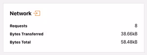
Thats a huge 95% decrease in total bytes from the first scan! You can see the full results of the scan for even more details.
Im old enough to remember a time when optimising websites to reduce load times was super important. Somewhere along the way, I forgot that—and I bet a lot of other people have too.
Some of you might scoff and say, “We have fast internet now. It’s not the dark ages of dial-up!” But have you ever struggled to load a site because you barely had reception? I did recently.
I kept a product page open in a tab on my phone, ready for the next time I went shopping. When I opened it in the store, it didn’t just load slowly—it failed completely. I had one bar of 4G because the shopping centre has terrible reception while inside. If I wanted to get the page to load, I would have had to step outside, find better reception, then go back in. Sure, there was public WiFi, but honestly? I’d rather lick a toilet bowl than use public WiFi. This shopping centre isnt out in the middle of nowhere either and its not the first time I get terrible mobile reception. Where I live Telstra claims there is no blackspot but we regularly have 1 bar of 4G or less, so when the WiFi goes out we cant even make calls if needed.
When I got home, I ran a scan of the site the product was on. Turns out, it ships ~12MB on a product page. I’m sure it’s not the worst offender on the internet, but that’s huge!
At the end of the day, every byte matters. Optimising my site wasn’t just about shaving off kilobytes for fun—it was about making intentional choices to create a faster, more accessible experience for everyone, no matter their device or connection.
It’s easy to fall into the trap of thinking that modern internet speeds make performance a lesser concern. But real-world conditions—bad reception, slow networks, and bloated pages—prove otherwise. If a website fails to load when someone needs it, does it even matter how beautifully designed it is or what fancy features it has?
So, if it’s been a while since you thought about your site’s performance, maybe now’s the time. Your future self (and your users) will thank you.